Healthper
One designer, every surface, one system

Problem
Nine touchpoints, nine looks. The brand red measured 4.2:1 on white, so every primary button failed WCAG AA.
My role
Sole designer across product UI, design system, brand, campaigns, website, client decks and data viz.
Outcome
A versioned React design system (206 tokens, 23 components, 82 icons, v2.0 and v2.1 releases) that fixed contrast everywhere at once, cut handoff time by 25% and carried 400+ daily posts.
- Role
- Product Designer · sole designer
- Team
- Sole designer, working with product and engineering
- Timeline
- Feb 2024 – present
- Tools
- Figma, React, TypeScript, Vite, OKLCH colour tooling, PowerPoint
- Product Design
- Design Systems
- Visual Design
- Development
Note. Client community posts and program-review decks contain confidential data. Everything shown is rebuilt with sample figures and placeholder names; the structure, hierarchy and visual system are the real work. The enterprise client is not named.
1. Context
Healthper is a health-tech and enterprise IT company and an Atlassian Silver Solution Partner. It runs three businesses under one brand: an employee well-being platform, enterprise IT consulting, and apps for Atlassian’s tools.
As the company’s designer I work across all three, and across every surface they touch: the product, the brand, marketing campaigns, the website, client reporting and Healthper’s own social channels.
2. The problem, measured
I audited nine touchpoints, including the website, the product page, two partner marketplaces, a press release, the video channel and the social profiles. I measured instead of eyeballing.
| Finding | Evidence | Impact |
|---|---|---|
| Brand red fails contrast | 4.2:1 on white; AA needs 4.5:1 | Every primary button and red label failed |
| Typeface drift | Product page in Avenir Next, main site in the brand face | Two brands in one sales funnel |
| No dark mode | No dark values anywhere | Clashed inside Jira’s dark theme |
| Identical product tiles | 7 of 9 marketplace listings used the same artwork | Buyers couldn’t tell programs apart |
| Failing partner button | Teal with white text at 2.3:1 | A key call to action fails WCAG |
| Assets scattered | Logos only on the website host, no usage rights | Wrong, blurry logos in vendor work |
3. The design system
- 1.
Primitives
Fifty raw colour values across five ramps, generated in OKLCH on Atlassian’s 100–1000 scale so each step has the same perceived lightness across hues. Never used directly.
- 2.
Semantic tokens
Intent-named tokens with a light and a dark value, such as --color-text, --color-action-primary and --color-surface-raised. Dark mode swaps only this layer.
- 3.
Components
23 typed, keyboard-accessible React components built on the semantic layer, so product code never changes between themes.
- design tokens, each with light and dark values
- 206
- Source: Healthper case study
- typed React components
- 23
- Source: Healthper case study
- icons drawn on one grid
- 82
- Source: Healthper case study
- brand assets catalogued with usage rights
- 103
- Source: Healthper case study
4. Key decisions
Before
4.2:1
Brand red behind white text
Fails AA for normal text.
After
5.1:1
Action red, step 600 of the same ramp
Passes AA. One token changed, and every button in every product followed.
- Fix the red without a rebrand. The brand red stays for the logo and large type; a slightly deeper red from the same ramp powers every action.
- Dark mode, because the users live in it. Jira admins work in dark mode for hours. Surfaces get lighter as they rise and red text moves up the ramp to stay readable.
- Be a good guest inside Atlassian. Inside Jira the brand steps back. Every token maps one-to-one to an Atlassian token, so porting a screen is a find-and-replace.
- A tile system for every program. One shape and colour per product family, plus a pictogram from the icon library, replaced seven identical marketplace tiles.
- Content rules from a page audit. Sentence-case headings, one call to action per page and no unsourced claims went into the guidelines next to the logo rules.
5. Governance and delivery
- Ownership model. Clear owners for foundations, components and documentation, so changes have a home.
- Semantic versioning. Tracked releases (v2.0, v2.1) with full changelogs, so product teams know what changed and when to upgrade.
- Contribution workflow. Issue triage, design review, then a pull request with before-and-after screenshots.
- Built with engineering. Figma prototypes turned into responsive, component-based React UIs alongside Agile product and engineering teams.
- less design-to-development handoff time
- 25%
- Source: Shyine’s résumé
- Lighthouse Accessibility after WCAG 2.1 audits
- 78 → 95+
- Source: Shyine’s résumé
- less rework from the brand template library
- 30%
- Source: Shyine’s résumé
6. The system at work
- daily posts over 13 months for an enterprise client community
- 400+
- Source: Healthper case study
- challenge campaigns, each with a full post lifecycle
- 6
- Source: Healthper case study
- editions from one codebase: team and view-only
- 2
- Source: Healthper case study
- A daily content system. A post template with a fixed reading order, evolved in three phases so each post reads faster at feed size.
- A number-first deck framework. Client program reviews used to bury the key figure in the fourth bullet. Now the agenda mirrors the questions clients ask, with one idea per slide and the number first.
- Product UI on the same tokens. Admin setup flows, Jira app panels and the AlignOps product page, so a buyer who reads a landing page and then opens the app sees one company.
- Website and growth. Ongoing updates to healthper.com, new landing pages, and a LinkedIn-led social strategy with a 30/60/90-day plan.
- Presentations and video. Enterprise sales, data-governance and infographic templates in PowerPoint and Figma, multi-client presentations, and short-form video for social.
7. Accessibility
| Check | Result |
|---|---|
| Text tokens, light mode | All pass WCAG 2.1 AA |
| Text tokens, dark mode | All pass AA (subtle text 5.8:1, body 14.6:1) |
| Inputs and focus | Pass 3:1 non-text contrast in both modes |
| Keyboard | Tabs, modal focus trap, search, tooltips and menus fully operable |
| Motion | Every animation turns off under reduced motion |
| Status | Never colour alone: a dot, an icon and a label |
8. Earlier chapter: the 2021–22 website redesign
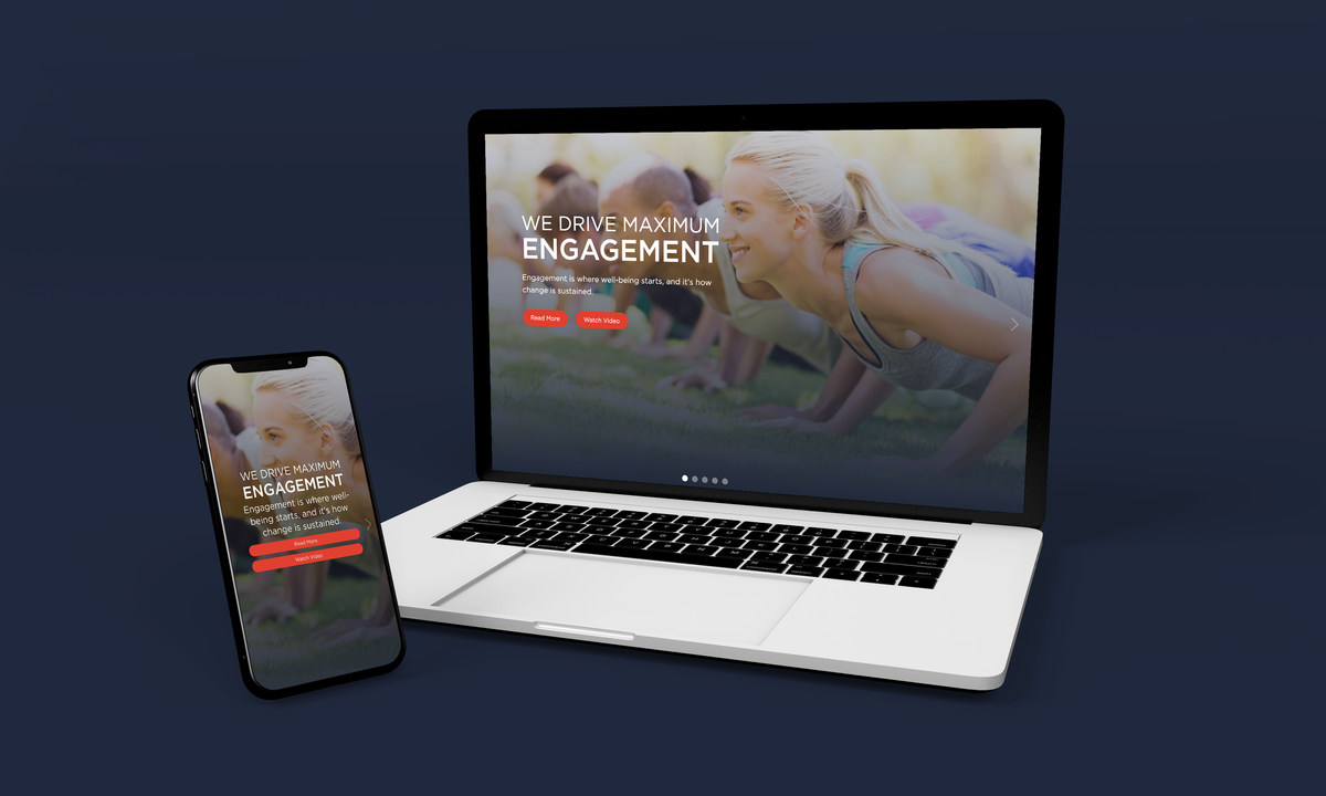
My first stint at Healthper (May 2021 – Feb 2022) included redesigning healthper.com for a younger audience. I designed it in Figma and built it in Webflow within 60 days, working with the founder, project managers and engineers. It has its own case study: Healthper Website Redesign.
9. What’s next
Targets, not yet results
Accessibility and single-source goals are achieved. Adoption measures (time to a first themed screen, off-brand assets per quarter, Marketplace review pass rate) are tracked from launch and will be reported when there is data. The personas are proto-personas from stakeholder conversations; validating them in interviews is the next step.
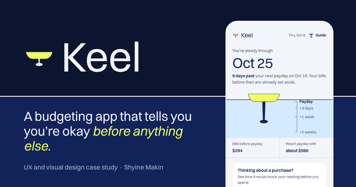 Next projectKeelA money app for the bad weeks