Cartogra
Responsive layouts and a validated booking flow for a travel site
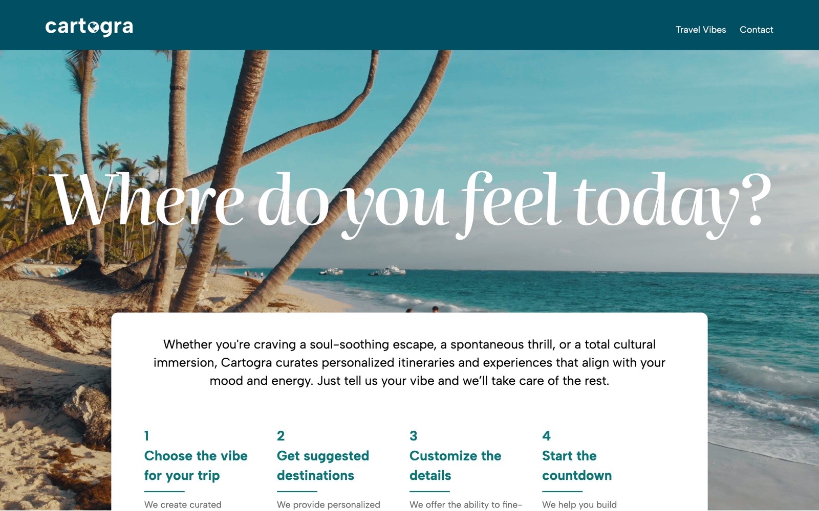
Problem
Take a starter travel site and finish it: make the homepage’s featured destinations work at every screen size, fix content and accessibility gaps, and add a way to book.
My role
Front-end developer: responsive SCSS, page and content updates across the site, alt text, and the JavaScript contact flow.
Outcome
A Featured Destinations section that reflows across mobile, tablet (760px) and desktop (1200px), alt text on every image, and a contact-to-confirmation flow: about 1,700 lines of my own HTML, SCSS and JavaScript.
- Role
- Front-end developer (solo): HTML, SCSS and JavaScript
- Team
- Solo, on a starter site BrainStation provided
- Timeline
- Oct – Nov 2025 · two sprints
- Tools
- HTML5, SCSS (Sass modules), BEM, Flexbox, JavaScript (ES6+), Responsive design, Git & GitHub
- Development
Note. A BrainStation sprint project built on a starter that already included most pages and base styles. Everything described below is work I added; git blame on the repository shows the split. The form simulates submission (no back end). Screenshots are from the project running locally.
1. Overview
Cartogra plans trips around how you want to feel: you pick a vibe (escape, excitement, family, nature, relaxation or romance) and it suggests destinations. The sprint starter provided the page structure and base styles; my job was to finish it and add a booking flow.
- 1.
Sprint 1: responsive homepage and content
I built the homepage’s Featured Destinations section (419 lines of SCSS), renamed the Adventure vibe to Excitement across every page, replaced the Whistler page with Amalfi Coast, fixed links site-wide and wrote alt text for every image. 26 commits.
- 2.
Sprint 2: the booking flow
A contact page, a JavaScript-validated form, a confirmation page and their SCSS, with every “Book now” button across the 20 vibe and destination pages pointed at it. I also worked through the sprint 1 feedback: px to rem, relative link paths and a cleaner homepage layout. 14 commits.
2. Responsive featured destinations
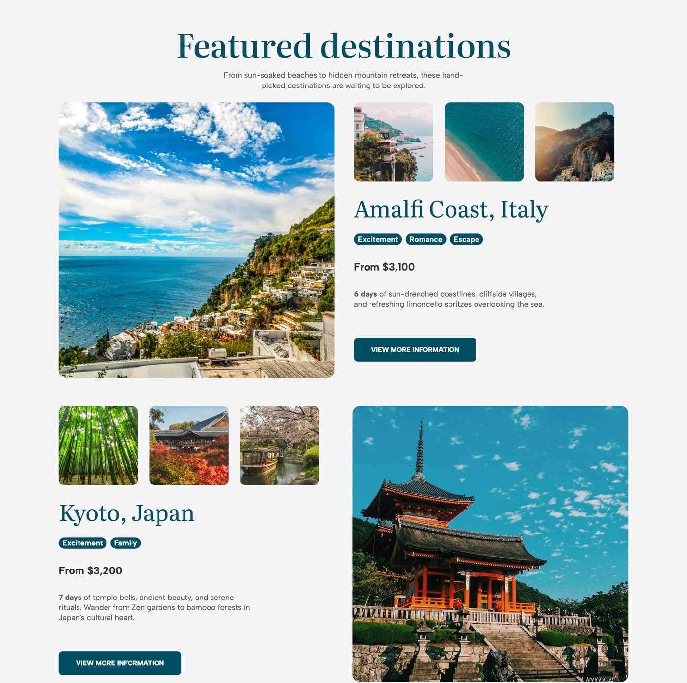
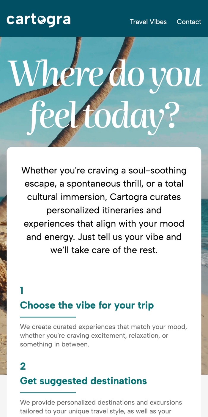
- Mobile: cards stack, with the thumbnails in a set order above the details.
- Tablet (760px+): a .fd-thumbs--three modifier shows three thumbnails and reorders them only at this breakpoint, so the mobile and desktop logic stays untouched. Images are held to exact 578px squares.
- Desktop (1200px+): two-column flex cards with the image and details side by side, alternating with row-reverse on every even card.
styles/partials/blocks/_featured-destination-frontpage.scss@include tablet {
.fd-thumbs--three {
> li { order: initial; }
> li:nth-child(1) { order: 3; }
> li:nth-child(2) { order: 2; }
> li:nth-child(3) { order: 1; }
> li:nth-child(4) { display: none; } // keep the 4th hidden
}
}
@include desktop {
// Two-column card
.featured-destinations__image-card {
display: flex;
flex-direction: row;
align-items: flex-start;
gap: pxToRem(41);
min-height: pxToRem(578);
}
.featured-destinations__link:nth-child(even)
.featured-destinations__image-card {
flex-direction: row-reverse;
}
}Excerpt, lightly condensed from the original file.
3. The booking flow
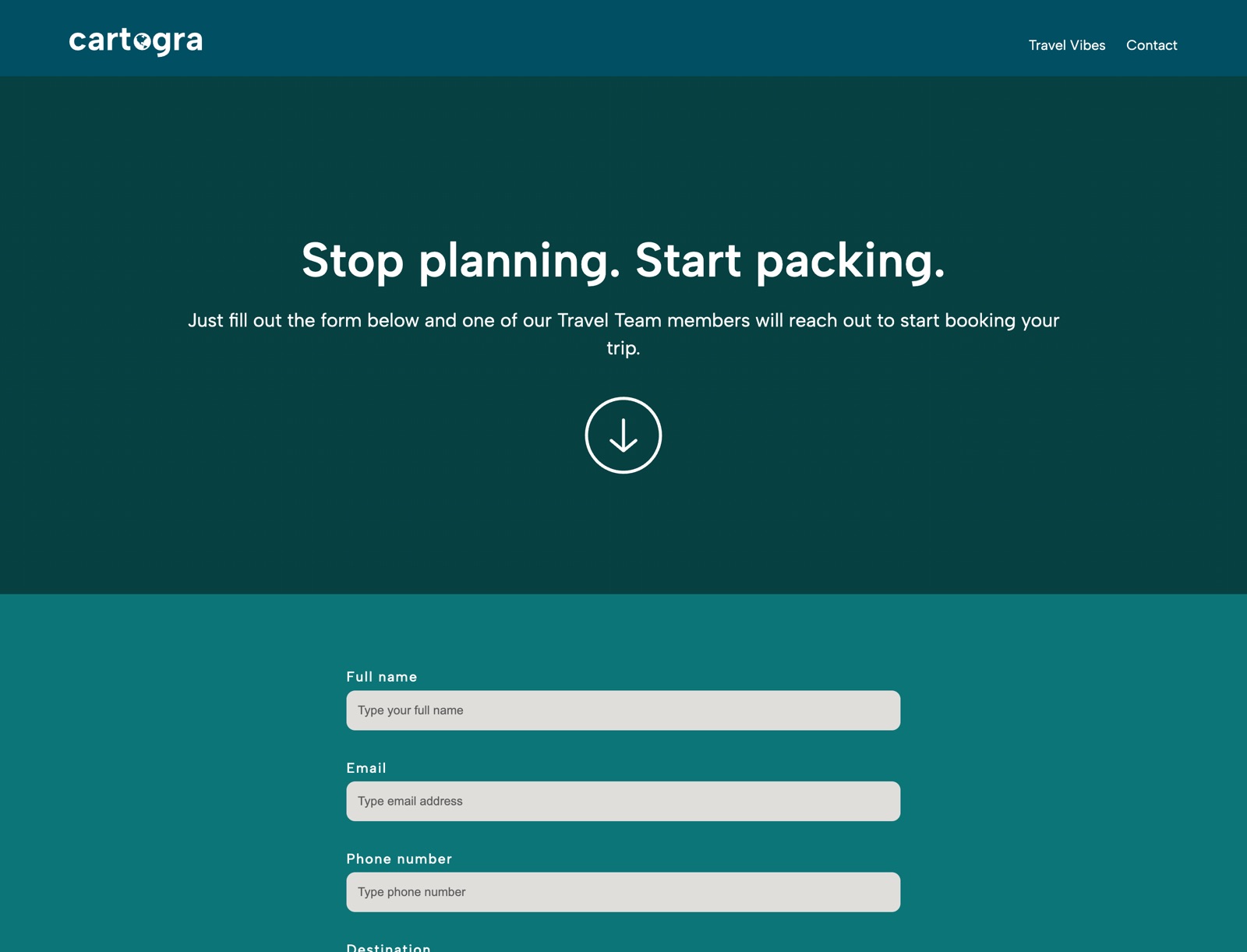
- Validation on blur and on submit. Each field has its own validator: name (2+ characters), email pattern, phone (exactly 10 digits), destination selected, consent checked. Errors show inline and clear as soon as you start typing.
- Input sanitising. The phone field strips non-digits and caps input at 10 as you type.
- Data-driven select. The 14 destinations come from one array and are rendered into the dropdown, so the list can’t drift from the destination pages.
- Defensive setup. The script exits quietly if any expected element is missing, so it can be included on pages without the form.
- Submit flow. On a valid submit the button disables and reads “Submitting…”, the name and destination are saved to sessionStorage for the confirmation step, and the page redirects.
scripts/form.jsform.addEventListener("submit", (event) => {
event.preventDefault();
const isFormValid =
validateFullName() &&
validateEmail() &&
validatePhone() &&
validateDestination() &&
validateConsent();
if (!isFormValid) return; // inline errors already shown
sessionStorage.setItem("cartograName", fullNameInput.value.trim());
sessionStorage.setItem("cartograDestination", selectedDestination);
submitBtn.disabled = true;
submitBtn.textContent = "Submitting...";
setTimeout(() => (window.location.href = "./confirmation.html"), 2000);
});Condensed for reading. In the original, each validator runs on its own line first, so every invalid field shows its error at once rather than stopping at the first.
 Next projectFernwellBanking copy that passes compliance and still calms a declined card