Healthper Website Redesign
A well-being company’s website, rebuilt for a younger audience

Problem
An outdated site with hard-to-use navigation and little interactivity was failing to explain Healthper’s programs to younger visitors.
My role
UX/UI design, content development and the Webflow build, with the founder, PMs and engineers.
Outcome
A live Webflow site with a structured program showcase, delivered in 60 days, alongside social and email campaigns that grew traffic, engagement and subscribers.
- Role
- UI/UX Designer & Brand Designer
- Team
- Worked with the founder, project managers and engineers
- Timeline
- 60 days, Fall 2021 – Winter 2022
- Tools
- Figma, Adobe XD, Webflow, Miro, Trello, Slack
- UX/UI
- Visual Design
1. Problem
Healthper designs branded well-being programs for workplaces. Its website was outdated, hard to navigate and lacked the interactivity a Gen-Z audience expects, so it struggled to communicate the company’s value.
- Outdated design. The site didn’t reflect current standards or its audience’s interests.
- Poor experience. Navigation and content presentation weren’t user-friendly.
- Missing features. Little interactivity to engage visitors.
2. Process
- 1.
Research & planning
Collected assets and content, confirmed copy with the client and reviewed the existing site.
- 2.
Sketching & wireframing
New layouts, client feedback sessions and brainstorming for new features.
- 3.
Design & prototyping
Wireframes and high-fidelity mockups in Figma, tested and refined.
- 4.
Launch
Built in Webflow, launched and monitored after release.

3. The design
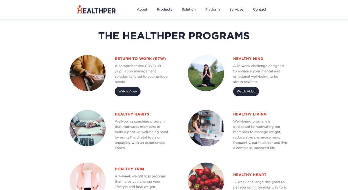
A clean, modern home page with clear navigation, and a structured program showcase that gives easy access to each program’s details. Modern UI elements, animation and hover effects add interaction.

Results
The original case study reports gains in user satisfaction and client engagement. Those figures are being verified before they are shown here.
 Next projectPawshipsHelping dog owners find playdates nearby